Thursday, September 16, 2010

Week 6


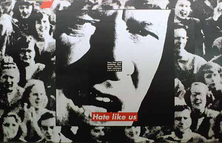
American conceptual/pop artistBarbara Kruger is internationally renowned for her signature black, white and red poster-style works of art that convey in-your-face messages on women's rights and issues of power. Coming out of the magazine publishing industry, Kruger knows precisely how to capture the viewer's attention with her bold and witty photomurals displayed on billboards, bus stops and public transportation as well as in major museums and galleries wordwide. She has edited books on cultural theory, including Remaking History for the Dia Foundation, and has published articles in the New York Times, Artforum, and other periodicals. Monographs on her work include Love for Sale, We Won't Play Nature to Your Culture and others. She is represented in New York by Mary Boone Gallery. A major exhibition of her work will be presented at the Museum of Contemporary Art in Los Angeles in fall 1999, and at the Whitney Museum in New York in 2000.

Research Kruger's work to find an example from the 1970s or 1980s to compare with a more recent work. How has Kruger's work changed with the developments in contemporary visual arts? Describe a recent work that moves away from the 'poster' type work of her early career.


I have found that Kruger seems to be against with the way the humanity is turning out, she portrays this message through her bold and simple works.

I think a spatial piece would impact the audience more than a poster because a poster is a flat 2-dimensional work which can only be seen from one angle, whereas a 3-dimensional installation can be viewed from many different angles, each one being different.

Kruger uses Bold text and simple quotes and sayings which gives her work a strong impact and a sense of personality. Her phrases usually use pronouns such as you, I, your, we and they to adress the audience directly. Much of her text questions the viewer about feminism, classicism, consumerism, and individual autonomy and desire, although her black-and-white images are culled from the mainstream magazines that sell the very ideas she is disputing. Her new work is consistently about the kindnesses and brutalities of social life: about how we are to one another. Her opinions are very hash and blunt and how she reflects them in her work creates strong impact.

Week 4


1.Research Kapoor's work in order to discuss the ideas behind 3 quite different works from countries outside New Zealand.

"Shooting into the Corner" is a very interesting and unique work which consists of a cannon developed by Kapoor together with a team of engineers. A pneumatic compressor shoots 11-kilogram balls of wax into the gallery's corner across the room; all in all, 20 tons of wax will be "fired away" throughout the exhibition run. Loud aggression on the one hand and silent growth on the other give the piece tension, sensuality, and compelling power. I thought this work was really eye catching and made the viewer think about so many different emotions.


“I am interested in sculpture that manipulates the viewer into a specific relationship with both space and time.” –Anish Kapoor, Tate Magazine, July 2007

The sculpture is fabricated in a custom deep red PVC-coated polyester fabric by Ferrari Textiles supported by two identical matching red structural steel ellipses that weigh 42,750kg each. The fabric by its self weighs 7,200kg. the sculpture sits on a carefully cut hill and creates a kaleidoscopic view of the beautiful Kaipara Harbor at the vertical ellipse end and the hand contoured rolling valleys and hills of “The Farm” from the horizontal ellipse.

I really like this sculpture by kapoor. Because it does not really blend in with the scenery it creates this sort of portal which really allows you to appreciate New Zealand's beautiful land. The sculpture definitely has a WOW factor because of its scale and abnormal shape that creates confusion of how it was made. to me the sculpture looks like a sort of instrument. Anish kapok is very talented and i enjoy looking at each one of his works.


Kapoors work is located in Kaipara bay on a place called 'the farm' which is an 1 acre site north of auckland. The sculpture is named after its site and is designed to withstand the high winds that blow inland from the Tasman Sea off the northwest coast of New Zealand’s North Island. The materials i have listed are in the above question and i have explained some of the ideas behind it.


Week 5


Kehinde is almost crossing over old medieval tradition (with the use of gold frames) with this modern day Hip-Hop feel to his figures. His works are very busy, with the background and the foreground being hard to decifer. His poses represent power and spiritual awakening. They are also portrayed in a heroic manner. The portraits are based on every day men he sees on the streets. He mixes hip-hop with Renaissance poses and gets the young men to pose. Kehinde decribes his work as "interrogating the notion of the master painter, at once critical and complicit.


Kehinde's work raises questions around social/cultural hierarchies , colonisation, globalisation, stereotypes and the politics which govern a western worldview.

Wednesday, September 1, 2010

Week 3-The Walters Awards


1. What is the background to the Walters Prize?

The Walters Prize is New Zealand's most prestigious contemporary art prize. This biennial award recognises an artist who has made an outstanding contribution to contemporary art in New Zealand in the two years prior. Named in honour of artist Gordon Walters, it was established by founding benefactors and principal donors Erika and Robin Congreve and Dame Jenny Gibbs to make contemporary art a more widely recognised and debated and prominent feature of New Zealand cultural life.

http://www.aucklandartgallery.com/whats-on/events/2010/july/the-walters-prize-2010

2. List the 4 selected artists for 2010 and briefly describe their work.


Dan Arps: Explaining Things shown at Gambia Castle, Auckland (7-24 December 2008).
Dan Arps work consists of works created using objects one would see on a day to day basis to show the simplicity of each piece.

Fiona Connor: Something Transparent (please go round the back) shown at Michael Lett, Auckland (15 April – 16 May 2009)

Conners work was a architectural piece that consisted of two doorways separated by roof supports attached to the ground. The sterile white structure was made out of wood and bolts, a very neat and tidy work.

Saskia Leek: Yellow is the Putty of the World shown at Ivan Anthony Gallery, Auckland (25 November - 23 December 2009)

Leeks work consisted of several paintings that were pastel colored with geometric shapes creating buildings and objects.

Alex Monteith: Passing Manoeuvre with Two Motorcycles and 584 Vehicles for Two-Channel Video shown at ST PAUL St, Auckland (19 June - 7 July 2008

Alex Monteith's work was a video of two motorbikes illegally driving through congested traffic. One bike filmed the front bike while the front bike had a camera facing backwards at the second bike. this two angled video was a very interesting piece.


3. Who are the jury members for 2010?

Jon Bywater : - Programme Leader, Critical Studies at Elam School of Fine Art, The University of Auckland.

Rhana Devenport : - Director, Govett-Brewster Art Gallery, New Plymouth
Leonhard Emmerling: - Visual Arts Adviser, Goethe Institute, Munich,
Germany, former Director, ST PAUL St, AUT University
Kate Montgomery : - Director, Physics Room, Christchurch


4. Who is the judge for 2010 and what is his position in the art world?


Vicente Todoli will judge the Walters Prize 2010 and announce the award winner on 8 October. Vicente was director of London's Tate Modern from 2003-2010. He was a prime mover in the Tate's global success - now the most visited modern art museum in the world. From 1989-96 Todolí was artistic director for The Valencia Institute for Modern Art (IVAM), Spain, and before it opened he was their Chief curator. Throughout his distinguished career he organised and curated internationally renowned exhibitions of work by contemporary artists, making him the perfect choice to be this years judge.


References:

http://www.thebigidea.co.nz/news/industry-news/2010/apr/68823-walters-prize-2010-finalists


http://www.aucklandartgallery.com/whats-on/events/2010/july/the-walters-prize-2010


http://cadiblog2010.blogspot.com/2010/08/week-3-walters-prize-2010.html

Tuesday, August 31, 2010

Week 2 Hussein Chalayan


1. Chalayan’s works in clothing, like Afterwords (2000) andBurka (1996) , are often challenging to both the viewer and the wearer. What are your personal responses to these works? AreAfterwords and Burka fashion, or are they art? What is the difference?

I personally believe that 'Burka' is more on the art side whereas 'Afterwords' is more fashion. I believe this because art has more of a meaning or message behind but fashion is more about pushing the limits rather than portraying an idea.


2. Chalayan has strong links to industry. Pieces like The Level Tunnel (2006) and Repose (2006) are made in collaboration with, and paid for by, commercial business; in these cases, a vodka company and a crystal manufacturer. How does this impact on the nature of Chalayan’s work? Does the meaning of art change when it is used to sell products? Is it still art?

It makes it more mainstream and almost makes the artist a sellout. Pure artists make work for themselves not others, by doing work for companies it constricts them to boundaries or demands made by that company so its not a true piece to Husseins full potential. It still would be art but now classified as commercial art.


3. Chalayan’s film Absent Presence screened at the 2005 Venice Biennale. It features the process of caring for worn clothes, and retrieving and analysing the traces of the wearer, in the form of DNA. This work has been influenced by many different art movements; can you think of some, and in what ways they might have inspired Chalayan’s approach?

I believe that fashion/wearable art would of been a major influence on 'Absent Presence' by Hussein because it shows how much people care for their clothes in the modern life and how much a few pieces of fabric can mean to a person.


4. Many of Chalayan’s pieces are physically designed and constructed by someone else; for example, sculptor Lone Sigurdsson made some works from Chalayan’s Echoform (1999) and Before Minus Now (2000) fashion ranges. In fashion design this is standard practice, but in art it remains unexpected. Work by artists such as Jackson Pollock hold their value in the fact that he personally made the painting. Contrastingly, Andy Warhol’s pop art was largely produced in a New York collective called The Factory, and many of his silk-screened works were produced by assistants. Contemporarily, Damien Hirst doesn’t personally build his vitrines or preserve the sharks himself. So when and why is it important that the artist personally made the piece?

It is important for the artist to produce a piece of work when its

Semester 2- Week One Nathalie Djurberg's 'Claymations'


1. What do you understand by the word 'claymation'?

I understand the word claymation to mean animation using clay through the process of sculpting. This is the technique such movies like 'Lord of The Rings' and 'Wallace and Gromit' use.

2. What is meant by the term 'surrealistic Garden of Eden'? and 'all that is natural goes away'?

The term 'surrealistic Garden of Eden' means out of the ordinary plants and humans, ones that are unrealistic and have a disturbed and dark feel to them. The term 'all that is nature goes away' means that there is no greenery or any form of nature represented by these claymations.

3. What are the 'complexity of emotions' that Djurberg confronts us with?

I believe that Djurberg leaves us with a variety of emotions, such as confusion, fear and curiosity. Confusion because it leaves the audience confused as to why she would want to create such a piece like this and also confused because there is so much we cant understand about the work. Fear because the pieces are grim and have a dark, intimidating feel to them. And curiosity because we want to know what the plants really are.

4. How does Djurberg play with the ideas of children's stories, and innocence in some of her work?

She does this by using sculptured flowers and children within her works but she adds her own style to it and makes them look slightly deranged and twisted.

5. There is a current fascination by some designers with turning the innocent and sweet into something disturbing. Why do you think this has come about?

I think this has come about because the world is full darkness and misfortune and nobody is really happy. I also believe this because alot of the artwork up until now has had a happy feel toward it in the way other artists use colour and subject etc.

6. In your opinion, why do you think Djurberg's work is so interesting that it was chosen for the Venice Biennale?

I think it was so interesting because there are very few artists of that style and it really sets her aside. Also because i feel that it could almost tell a story, the way the deformed plants almost talk to eachother with all the different textures and colours.

7. Add some of your own personal comments on her work.

I personall really enjoy Djurbergs work as it something you dont see everyday and claymation is very uncommon. She also put a different spin on childrens stories.

Monday, June 7, 2010

Banksy

The artist known as Banksy was born in 1974 and his real name is to be rumored as Robert or Robin Banks. Banksy, himself, on his website he says, "I am unable to comment on who may or may not be Banksy, but anyone described as being 'good at drawing' doesn't sound like me."
He started as a tagger (1992–1994) as one of Bristol's DryBreadZ Crew (DBZ). He was inspired by local artists and his work was part of the larger Bristol underground scene. By 2000 he had moved toward stenciling after realising how much less time it took to complete a piece. Banksy was said to be hiding from the police under a train carriage when he noticed the stenciling serial number and by employing this technique, Bristol and London soon noticed him for his art around the place. A quote from Banksy about his stenciling quotes, "I use whatever it takes. Sometimes that just means drawing a moustache on a girl's face on some billboard, sometimes that means sweating for days over an intricate drawing. Efficiency is the key."

I believe Banksys work is graffiti because it is done illigaly in the streets, which is the definition of graffiti. Another reason i believe this is because graffiti has a purpose or a message to get across to people, which is exactly what banksy achieves. His works consist of mainly stencil work which another reason in why i believe his art is classified as graffiti. A mural is conformist and typical/expected due to the fact you get told what to paint, when to paint, how to paint it and also given permiss to paint that surface, But banksy breaks out of the norm and does what he wants to do and paints the messages he wants to get across to people all whilst being illegal and unkown.

His work is very controversial and political and everybody has a different opinion about, personally i cant get enough of it but others may see it as mindless vandalism. His work can not exactly be sold because it is sprayed onto property in which he doesn't own. Although some of his work that isnt his usual illegal wall sprayed is used for things such as album covers for bands like blur.

http://www.banksy.co.uk/